
Is your website designed to be mobile-friendly? If it’s not, you have until April 21st to make some changes. Starting April 21, 2015, Google is rewarding those websites that are mobile-friendly with better search rankings.
How do you know if your website is mobile-friendly?
Google has a webmaster tool that you can use to check if your website is mobile-friendly. Just put in your site’s URL and wait 20-30 seconds while it analyzes your website.
If your website is mobile-friendly, you’ll get something that looks a little like this:

Congratulations! Your website passed Google’s mobile-friendly test!
Today, many websites are built with mobile in mind. However, mobile-friendly does not mean your site is user-friendly. The best sites will be a combination of mobile-optimized and responsive design.
If your website is not mobile-friendly, then Google will show you something like this:
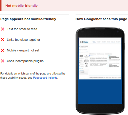
The bad news is if your website is not mobile-friendly there isn’t necessarily a one stop, fix-all solution. How to fix your website primarily depends on how your website was built, who built it, and who has access to make changes.
Remember to backup your site before starting to make any changes!
How was your website built?
Was your website built using a content management system (CMS)? (Examples of popular CMSes include WordPress, Joomla, Drupal, and Magento.)
If your website was built using a CMS, check out Google’s list of technical guides on various CMSes to making your website mobile friendly. If you haven’t installed updates for the theme or templates on your website, that may be all you need. Other problems could be related to the plugins that are installed.
OR
Was your website custom built with a programming language? (A few common languages used for building websites include Ruby, Python, JavaScript, PHP, Java, and Perl.)
If this is the case, then Google’s guide on mobile SEO could be helpful to figuring out and solving the problem.
Who built your website, and who has access to make changes?
Some people build or code their own sites, while others outsource it to a developer. If you built it yourself, check out the above links. For those of you working with a developer, Google’s webmaster tools has some helpful advice.
Even if you had a developer build your website on a CMS (like WordPress), installing updates may be the quick fix you can do yourself. If this is not something you are comfortable doing, or it doesn’t fix the problem, then talk to your developer. If your developer can’t or doesn’t know how to fix the problem, you should find a new developer.
Once your website is deemed mobile-friendly by Google, your site will be given a mobile-friendly label. You won’t see this label if you perform a search for your site on a desktop. This label only appears when searches are performed on a mobile device.
It looks like this:

A mobile-unfriendly website will not completely doom your search rankings. Many factors go into search rankings, however mobile friendliness does represent a larger trend.
Mobile-based searches are only going to continue to increase. Traffic will flock to those websites that are mobile-friendly or mobile-optimized over those that are not. Less traffic and higher bounce rates from poor usability over time will hurt your rankings.
While a lot of factors go into search rankings, don’t let mobile-friendliness be a factor that counts against you.