
Many people associate conversion rate optimization (CRO) with A/B testing or other kinds of split testing. Testing is part of CRO, but it is only one facet.
Wikipedia defines conversion rate optimization as “the method of creating an experience for a website or landing page visitor with the goal of increasing the percentage of visitors that convert into customers”.
That’s a great definition. A long one too! Which leaves you thinking- “where do I actually start?”
The obvious answer is your website. That’s where you want to optimize your conversions. But websites have a lot of variation and complexity. This is where the Hierarchy of Optimization comes into play.
The Hierarchy of Optimization is the methodology behind conversion rate optimization. It provides a structured, systematic approach to improving the performance of your website and your conversions.
The Model Behind the Methodology
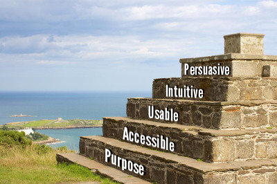
The Hierarchy of Optimization framework is based on Maslow’s Hierarchy of Needs pyramid model.
Just like with Maslow’s model, the basic requirements of your website are at the bottom, while the more sophisticated requirements are on top. Without the lower levels, your website will not function. It’s important to remember— if your website fails at one level, then the subsequent levels are negatively impacted and your conversion rate suffers.
The five levels are:
- Purpose
- Accessible
- Usable
- Intuitive
- Persuasive
If you are looking for the foundational building blocks to improve your conversions, or you’re launching/redesigning your website, then you are in the right place!
So, let’s go build a pyramid!
1. Purpose
Purpose is at the base of your optimization hierarchy pyramid. Without a purpose, why even have a website?
What purpose is your website supposed to fulfill?
What are your website’s unique objectives and needs for your business?
Are you selling a product or service? Think of websites like Amazon (e-commerce), Basecamp (project management service), and Salesforce (CRM product).
Are you giving information or educating your customer base? Chili’s and other restaurants have their menus, nutritional information, locations, pictures, and other information to interest customers in the restaurant’s food.
Are you looking for engagement and clicking on ads? Facebook and Youtube both try to keep users on their sites as long as possible. The longer users are engaged on the site the more likely a user will click on an ad.
Some websites may fall into more than one category, like Pandora. They are engaging their customer base with the music, who also listens to the ads. Or customers buy the subscription to listen without ads.
The purpose of your website should be clearly defined. Clarity is key! Everything on your website will stem from this purpose. If you don’t know what you are trying to accomplish with your website, then how can you expect your visitors to know?
2. Accessible
Having a purpose is great, but if your website can’t be accessed then you are up a creek without a paddle.
Does your website work?
Do all of the features on your website work?
Are their functions executable?
An example is a shopping cart feature. Is each step of the sales process executable? This starts with finding or accessing the product on your website. Then adding the product to the shopping cart. Lastly, checking out and paying for the product.
If your website’s primary purpose is unable to be fulfilled because something doesn’t work, a user can’t access your website, or find your product, then nothing else matters.
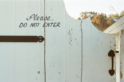
Website accessibility problems
Error 404: page not found
The “Error 404: page not found” is the error that you receive when you have a broken link, a changed link, or a link that doesn’t actually exist for some reason. (A common reason for a link that doesn’t exist is a typo in the URL.)
The standard 404 error is actually just code that gets spit out by the server. It’s plain text that a user cannot interact with or be redirected from. Basically, this is as inaccessible as it gets.
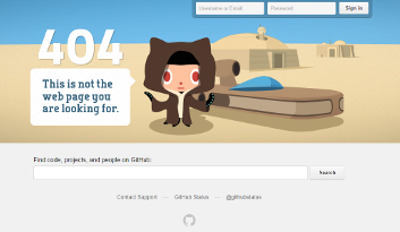
If you change a link, it’s best to set up a 301 redirect (more on that in a little bit). If you delete a page or link, a custom error 404 page can be a fun way to help get your user back on track. You can also give suggestions on where your user might like to go, or just have fun with it!
If you are a Star Wars fan like me, than you’ll love Github’s custom error 404 page.
301 redirect
If you change the URL for your page or website, you need to set up a 301 redirect. This tells the search engines (and anyone linking to your old URL) that your page has permanently changed to a new name or location. 301 redirects are especially important for SEO! They transfer a majority of your SEO juice (90–99%) from the old URL page to the new one.
Yes, your SEO ranking may take a slight hit. However, this is much better than starting with zero SEO juice.
Product Accessibility on Your Website
Is your product accessible to your customer base? If a potential customer is looking for your product or service, how easy is it for them to find it on your website? Additionally, how easy is it for the customer to move through your sales funnel to complete the sale?
Make your shopping cart easy to find and use. According to Listrak’s 2014 Annual Study of Email Tactics used by the top 1000 Internet Retailers, “74% of online sales are abandoned before the customer completes the traction”.
Think about that for a second…
3 out of 4 online sales are not completed. How much lost revenue does that represent for your company? Make your products easy to find and easy to purchase.
Don’t hide your sales cart, let it stand out. If customers need to contact you directly to make a purchase, make sure your contact information is easily visible on EVERY page of your site.
The Lower Levels Versus the Upper Levels
Thus far we have covered the two fundamental layers of the pyramid: purpose and accessibility. Like Maslow’s Hierarchy of Needs, the two lowest layers are the most basic but most crucial in our Hierarchy of Optimization.
Without these lower levels, nothing else matters. However, your users won’t realize this. They only see your website when it’s accessible. It’s only the three upper levels that your users truly interact with.
So, let’s keep climbing.
3. Usable
Is your website usable?
Maybe you are thinking— “Wait a minute. My website works. It’s accessible. Of course it’s usable!”
Not so fast. Contrary to popular belief, just because something is functional does not mean it is usable.

Have you ever tried to drink a thick milkshake out of a small straw? You aren’t going to get much of that milkshake any time soon. That straw is functional, but it’s not very usable.
How long does it take for your website to load?
“Your website is too easy to use. It’s too fast and too clear to understand.” — Said no one EVER!
UX design (user experience design) is your BEST friend when it comes to designing your website. You want your navigation to be user-friendly. This starts to overlap with being intuitive (more on that later).
What about mobile responsive design?
Is your website designed to work on multiple devices? Nothing scares off customers faster than an unusable site.
Part of being user-friendly is being click-friendly. Here are some of the tools that we recommend for helping to become more user and click-friendly:
Crazyegg for heatmaps and click maps of your website. Helps you understand and see where your visitors are looking and clicking.
Usertesting.com for real users telling you what they think about using your website while they use it.

The shortest distance between two points is a straight line. Usability of your website should be like a straight line, not a squiggle… Or any other shape for that matter.
Your visitors should spend their time experiencing whatever the purpose of your website is. Visitors should NOT be spending their time trying to figure out how to use your website.
4. Intuitive
Intuitive and usable strongly go hand-in-hand with each other.
Can visitors find what they are looking for when they come to your website?
Yes? Great! … Is it where they expected to find it?
Your website should feel natural to use. Everything should be where visitors expect it to be. Is the contact information where they expect it? What about navigating around your website?
There should be a flow to the content and pages on your website. It should be obvious to your visitors where to go and what you want them to do.
In terms of the buying process, you want to make it as smooth as possible for your visitors. Most customers do some kind of research before making a purchase. Make product reviews, return policies, and the answers to FAQs easy to find.
Consider having a portfolio if you sell services like custom printing, photography, or website design. Could you imagine hiring a photographer without seeing any of their work?
Just this week I saw a website for a company doing web design with no portfolio. They wanted $1,500 for their web design service. I don’t know about you, but I’m not inclined to buy from them. If you don’t want to put your portfolio online, at least tell your visitors that you have samples upon request.
A demo video showing a product’s benefits and how to use it can also be a great addition.
People buy from people and companies they trust!
Consider what kind of objections a visitor might have to buying or converting. Your website should address these objections, and do it with as little usability friction as possible. Don’t play hide-and-seek with the answers!
Addressing questions and concerns up front builds trust and confidence in your company. This in turn will lead to more conversions and sales.
All of this starts to move us into the final step on our pyramid.
5. Persuasive

The top of the mountain is only the top because it has a whole mountain under it. At the same time, you can only get to the top of the mountain by climbing the rest of it. (I guess you could cheat and fly up there, but that’s besides the point.)
Persuasive is the hardest step of the pyramid to get to and to execute. (It’s all about being on top.) Persuasive also has the greatest impact on your sales funnel with your visitors. BUT it only counts if you have every layer of the pyramid before that!
You could have the most persuasive copy on your website, but if your website isn’t accessible or usable… Welp, you’re out of luck!
Users may not recognize how easy and intuitive your site is, that’s kind of the point. If your website is not easy to use, then visitors will really notice and won’t stick around for long.
Persuasive is where you bring your branding, marketing, and content strategies into play.
Each part of your website should have a singular goal that contributes to your website’s overall purpose. Branding, messaging, and content should all focus on achieving the singular goals and overarching purpose. Additionally, any A/B or split testing should have a singular goal that aims to improve your purpose. This clarity will make your website more persuasive to your visitors.
Going back to intuitive, know the objections or barriers your visitors have that stop them from buying. If you know these objections, you can systematically address them in your branding, messaging, and website copy.
DO NOT tell your customers what you think they want to hear. Your messaging and copy should convey the answers your customers need to hear. Talk to your customers, not at them.
If you aren’t sure what these objections are, ask them! User polls and surveys are great ways to get real feedback from your customer base. Also, look at your competitors. What are they doing that works that you aren’t?
However, don’t copy your competitors. Take what your competitors do well, and then make it better. Be innovative, and think outside of the box. With technology at their fingertips, users are the smartest they have ever been. If you don’t provide the answer or solution to their problem, they will go elsewhere.
If the user doesn’t know they have a problem, educate them. People tend to trust people and companies that give them valuable information. (Is it working yet?) As a result, when users are ready to buy, they will go back to the people who provided answers and value.
Wrap-Up
Conversion rate optimization is not just about doing one thing or about one piece. There isn’t a silver bullet. CRO is about how all of the different pieces come together.The whole is greater than the sum of its parts.
However, knowing where to start with all of the different pieces can be overwhelming. This is why we have a methodology to serve as a guide on how to approach conversion rate optimization.
As you noticed, many of the layers of the pyramid overlapped into each other. Each layer of the pyramid, is just that - a layer. Take out one layer, and at best you have a smaller pyramid. At worst your whole pyramid falls apart. Only when you put all of the layers together properly do you get a pyramid.
Each website will be unique, given the needs of the business. Regardless of this, you can apply the Hierarchy of Optimization to help improve the performance of your website and your conversions.
Questions about CRO or the Hierarchy of Optimization? Want help with your UX design?
Send me an email and let’s talk!
Or still not quite sure where to spend your time and resources?
Check out our CRO Critique. It’s a CRO critique of your website that is customized to your business and website’s purpose.
Maslow’s Hierarchy of Needs
In Maslow’s Hierarchy of Needs, the most fundamental needs for human motivation are at the bottom. Only once these basic needs are satisfied can someone fulfill higher order psychological needs. (Food, water, shelter, and safety trump belonging, esteem, and self-actualization. But combine all of the levels together and you have a happy, motivated individual.)
×