Slideshows, carousels, and rotating offers. Three names for the same thing: conversion killer! A lot of homepages have carousels. Marketers and clients of designers love them because carousels look cool. They let you get a lot more information on your homepage, and you don’t have to decide which is most important. If carousels are so cool and popular, why do your sales funnel and bottom line hate carousels?
The Key Reasons Why Carousels Kill Your Conversion Rate
- Low user engagement
- Low click-through rate
- Positioning overrules great content
- Usability sucks
- Banner blindness
Carousels have low levels of user engagement and click-through rates
Yes carousels look pretty, but people don’t engage with them. Don’t believe me? Erik Runyon proved it. (He’s the Director of Web Communications at the University of Notre Dame. He’s also a web developer.)
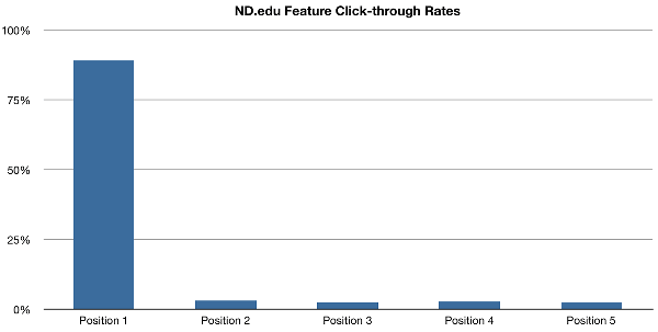
Erik tracked user engagement of carousels on four of Notre Dame’s websites. His findings: 1% of visitors clicked on the carousel. To put that in perspective, if you have 100,000 visitors to your website, only 1,000 will click on the carousel. And there’s more!
Taking a closer look at the features in positions 2-5 in the carousels, they range from approximately 3% in position 2 to 2.6% in position 5. Less than 3% of 1% of visitors clicked through a carousel.
If you had 100,000 visitors that 3% of 1% represents ONLY 30 visitors. That’s a pretty terrible click-through rate! Instead what matters is the position.
Position 1 Has the Highest Conversions, but You May Be Leaving Conversions on the Table
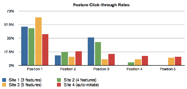
Maybe you’re thinking, “What if we rotate what is in the first position? Then we don’t have to worry about click-through rates.” From a usability stand-point, this is an awful idea (more explanation on that in a bit). Erik tracked this too. Here’s what he found (site 4 in red is the auto-rotate).
In short, whatever is shown in position one always has the highest conversion rate regardless of the message. The reason is position one receives the most traffic views and interaction (being first and all that). If the message in position one is not your most compelling message, then you are losing out on conversions and revenue.
A/B testing can help you determine your best message so you don’t leave conversions and money on the table. Here’s an example of how A/B testing could improve your conversion rate (or carousel, though we generally recommend not using carousels in the first place):
Let’s say you sell watches. You have three watches that are the same except for color: silver, blue, and black. You decide to have a carousel that shows each of the three watches in that order (silver, blue, and black).
We know from Erik’s study that the silver watch will receive the most traffic engagement. It will appear to have the highest conversion rate because of its position. However, had you A/B tested each of the watches individually your conversion rates change. For the sake of the example, say you found that the silver watch had a conversion rate of 10%, the blue 5%, and the black 20%.
Meaning the black watch, if it was in position 1, would double your conversions. Instead, the black watch is barely generating you any conversions hidden away in position 3.
The top of your homepage is prime real estate! You should have one focused message that maximizes visitor engagement. (If you aren’t sure on the best message, A/B test it.) The last thing you want to do is frustrate your visitors.
Carousels Frustrate and Annoy Visitors

Usability for carousels sucks! And auto-rotating carousels are the worst of the worst. Here’s why:
Some carousels auto-rotate and there is no navigation options for the user. Meaning if your visitor sees something they like and misses it, they have to wait through the whole slideshow again. Seriously?!? Who wants to do that? I’ll tell you who, nobody.
Visitors are less likely to generate a conversion when frustrated or annoyed.
Also, what if your user misses the content that was relevant to them? They may not even realize they missed something. The Neilsen Norman Group did a usability study on auto-forwarding carousels. They found that the user was given the task: “Does Siemens have any special deals on washing machines?” The user failed the task to find the needed information because the panel auto-rotated instead of staying still.
Second, even if you give your visitors navigation controls, everyone reads at different speeds. It’s annoying to have content change when you are in the middle of reading it. Or you have to wait for it to change.
As discussed previously, carousels that don’t auto-rotate will depend on position strength to generate conversions. This is of course assuming your visitors aren’t ignoring your carousel in the first place.
Visitors are Ignoring Your Carousel ON PURPOSE!
It’s called banner blindness. Consciously or subconsciously visitors are ignoring your carousels because they are mistaking them for an advertisement. (They look like banners.) Remember Erik Runyon’s research? 99% of visitors were NOT interacting with the carousel. Some visitors may have not found the content relevant, but a large number were probably just ignoring the carousel.
Consider this statistic from Solve Media (an advertising consulting company): you are 475.28 times more likely to survive a plane crash than you are to click on a banner ad. Meaning, if your visitors consciously or subconsciously think your carousel is an ad, it is going to get ignored. Your most important content is being ignored because it is in a carousel.
Alternatives to using a Carousel
At this point we are in agreement: carousels look cool but kill your conversion rate. So what other options do you have?
Kill the carousel and replace it with one main, focused message. If you aren’t sure which your best message is, A/B test it. (We can help you with that.)
Another option is to replace the carousel with a user self-identified persona like vitamintalent.com does.

Clicking “Hire Talent” vs “Looking for work?” directs the user to the most relevant part of the site for them. (Also notice the singular focused message!)
Depending on your business, replace the carousel with a video. It could be demoing a product or a relevant how-to video. Video content is a great addition to your site to help improve conversions. As an added bonus, video content will help your SEO rankings! Google ranks websites with video content higher than those without.
You could also replace the carousel with a call-to-action or sign-up form. No place on your website is more visible than the top of your homepage. It is prime real-estate. A strong call-to-action or sign-up form here that resonates with your visitors can give your conversion rate a healthy boost.
If You Must Use a Carousel…
There are times when a carousel is useful. But you should be careful when, where, and how they are used. Portfolios, a gallery of photographs, or any product that is very visually oriented are perfect examples. (Think about the real-estate industry or fashion/jewelry industries.)
Carousels should appear below the fold and contain non-vital content. You should not rely on a carousel as the primary delivery option for your most important content. Instead the carousel should complement your homepage content.
Make the carousel navigation obvious and 100% user controlled. Slower and international readers will thank you. In fact all of your visitors will thank you for returning the power to them.
Use no more than 3-4 slides on your carousel. The click-through rate is very low at this point. The chances of slides in position four and later being viewed are diminutive. (Really, the chances of slides after position one being viewed at all are small.)
In a select few circumstances, a carousel can be a beneficial addition to your homepage or website. However, most businesses don’t fall under those circumstances. Instead, their carousels are killing their conversions.
What next?
If your site has a carousel, send whoever needs convincing a link to this page before that carousel kills any more of your conversions.


